This is an example case study included to show how project pages render. Replace or delete it in Sanity Studio once real work is added.
The problem
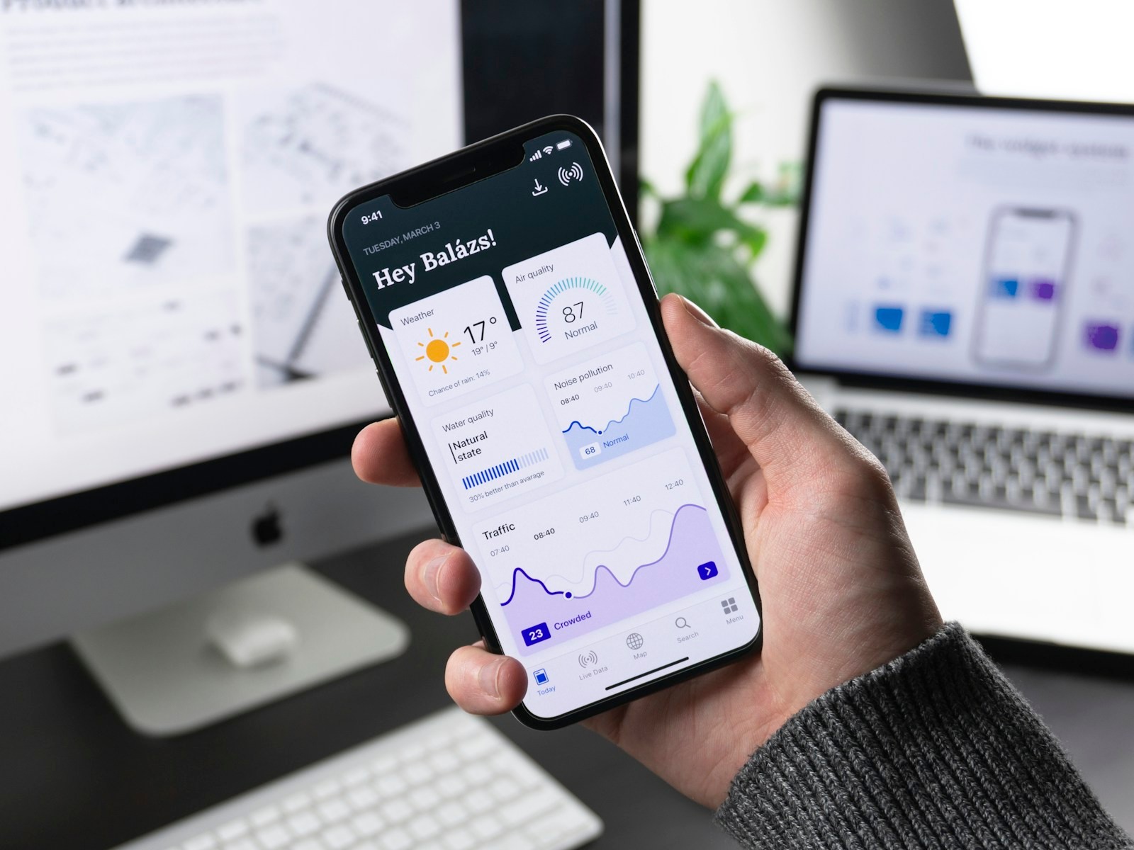
City environmental data already existed — air quality sensors, traffic feeds, noise monitors — but it was scattered across a dozen dashboards, none of them designed for a resident deciding whether to open a window or bike to work. The goal was to compress that into something glanceable.
Process
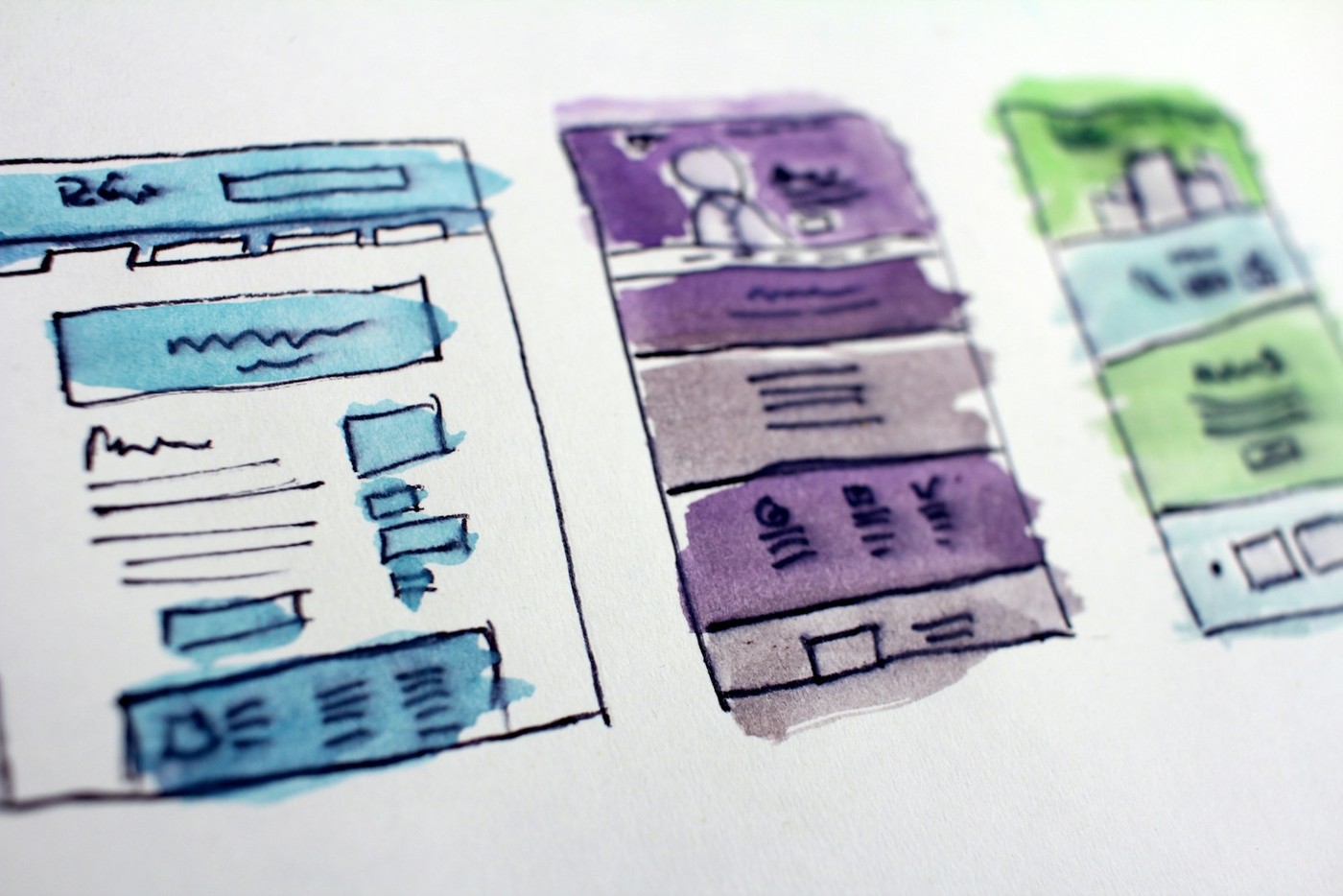
Early sketches focused on a single question per card — not raw numbers, but "is this normal for today?" That framing came directly out of interviews, where residents kept translating numeric readings into their own good/bad heuristics anyway.

Outcome
The final dashboard shipped as a working prototype with four daily cards — weather, air quality, water quality, and traffic/noise — each reduced to a single normal/abnormal read plus one line of context.